Home Depot Problem Discovery & Design Solutions
Winter 2019The Product
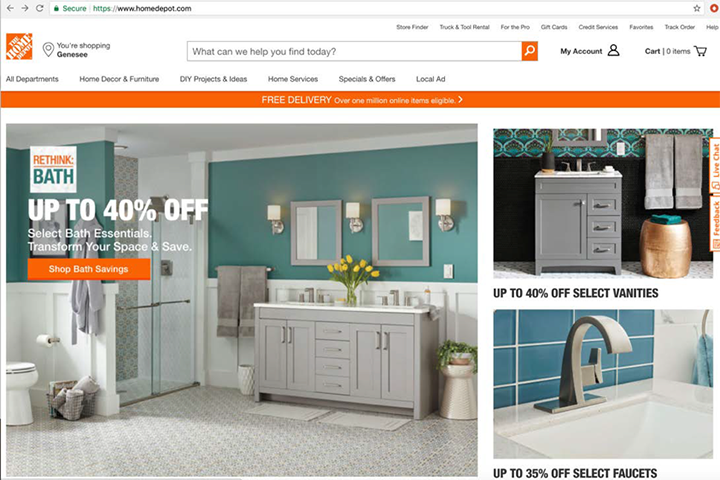
Home Depot (homedepot.com) online store.
The Purpose
Highlight most used function of the website, the Search function.
Project Keypoints
The Product Search Needs #gains
The Problem: Although the Search function takes up real estate in the header, the most dominant eyecatcher upon arrival is “FREE DELIVERY”. Additionally, multiple visual elements clutter the header where the Search function resides.
Why Users Need a Strong Search
User walkthroughs defined importance:
Observing users, during a sample product find, revealed that they only used the Search function.
When asked about the Main Navigation, individuals confirmed that they rarely use it unless “window shopping” or “browsing… a patient approach to finding products”.
With users showing the importance of Search in relation to the store products, the Search function needed centralized focus on the website.
Solution Mockup (Lo-Fi)
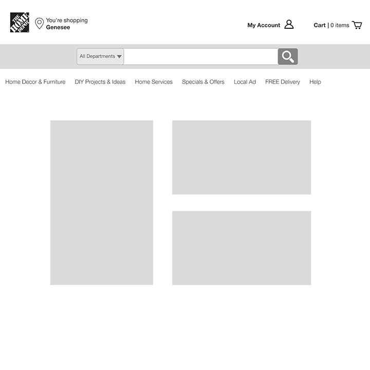
Mockup Highlights:
- Search Function’s presence is a main access point to The Home Depot’s products.
- Dedicated tier for Search Function.
- De-cluttered header:
- Moved “Free-delivery” to main navigation
- Add “All Departments” drop-down to Search Function
- Moved additional links at top into single “Help” link in main navigation
- Moved main navigation below Search Function section
Why It Helps the Customers
Comparative Analysis for Familiarity
The solution utilized familiar experiences mentioned in user interviews (Lowe’s, Amazon, and Google), where the Search Function was the most dominant element of the interface.


How the Design was Validated
A/B Test Sprint of Lo-Fi Mockup
Two lo-fi solutions were presented in front of users for testing.
“Which page do you feel is the best one to help you find your product?”
Idea 1:
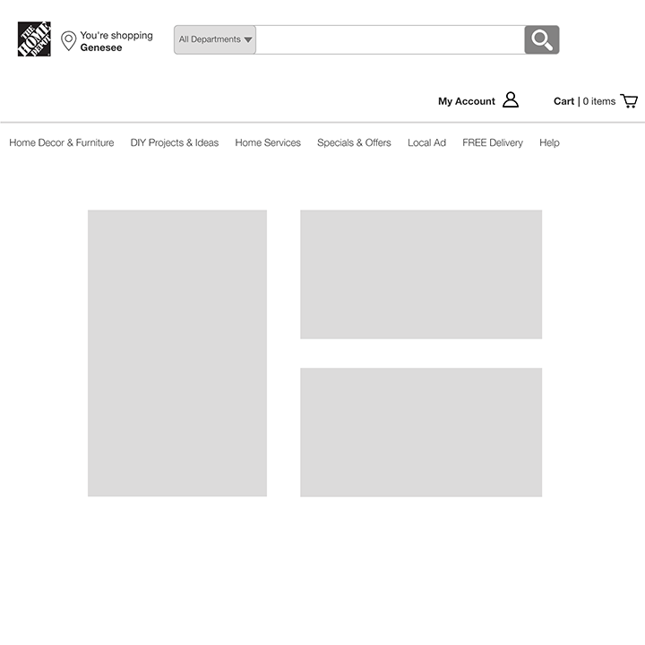
Idea 2:
- The solutions were derived from the comparative sites mentioned in the user interviews, in order to present the Search in a recognizable way.
Solution Analysis

- Replacing the "FREE DELIVERY" tier with a dedicated Search section was a less disruptive approach that also centralizes the search, similar to Lowes and Google.
- The drop-down feature of the category selection ("All Deparments"), similar to Amazon, is a bonus layer of filtering for large amounts of product.
- Moving the search out of the top tier declutters the header and highlights the search section.